
Between myself and my group I believe that we have created our project in such a way that the usual expectations of a short film can be recognised and challenged. Our film "Fatality" is rated a 15 and fits into the pyschological drama genre. Our opening titles immediately set the tone of our film and introduces the disturbing narrative. The title sequence we have made is very typical of a short film and the intensity it creates is fitting for the atmosphere we wanted throughout our entire film. The chapter markers are a way of narrating the film and they are reminiscent of silent films and the powerful psychological nature of the films made by Quentin Tarantino. The repetition we have used involving the sequence at the beginning of each of the four days gives a smooth rhythm to our film. This is also quite typical within the genre of short films as it is an easy way to flow through a narrative. The repetition is also a reminder of fairytales and childhood tales such as “Goldilocks and the Three Bears”. Another way we have kept the codes and conventions of short films the same is the changes of expectations of the audience within the narrative. With the use of the tickets, the telling of the fortunes was effective yet simple and left the audience wondering and making their own assumptions as what would happen next. The repetition of the tickets and fortunes with the resulting fates provide a sense of surrealism and a journey. The main way we have challenged the usual expectations of a short film is through the representation of gender. It is typical to have young female victims; however we have used a young male. We also used two female attackers instead of the typical male. I feel that we have used our research of short films to our advantage in respect to make our film recognisable as a short film, but individual as well.
The title sequence we created sets the tone for the narrative straightaway with the camera shot, movements and edits we used. The close ups of the clown leave the audience uncertain of the clowns surroundings, whereas the surroundings allow the audience to see every aspect of the clowns face. The numerous dissolves of the aspects of clown present many different angles of the clown and create a level of uncertainty within the mind of the viewer. We used a metallic sound effect and distorted it using an equaliser then repeated and layered the sound over the top of our title shots. This music also added to the level of uncertainty and mystery. The music steadily builds and gets louder as the credits of the production team and actors appear, this draws attention to the credits and the tension builds. We then used two graphics that fade into each other to create the word play for the title. As the film is about fate and destiny and the narrative leads to a climax of ambiguity, I came up with the name of “Fatality”. We then used a dissolve edit to change the shot from the word “Fate” to “Fatality”. We believed this would give an audience an idea of the narrative but also create pictures in their mind of what will actually happen.
We have used camera shots to create many emotions for the audience and to display our narrative. Whilst the shots in our title sequence create a level of uncertainty the master shot, or establishing shot, at the beginning of each of the four days forms a sense of anticipation and makes the audience familiar with the location. We used a close up of the coin in the man’s hand to make it very apparent to the view that he had picked up a coin. This is similar to the type of shot that would be used in an advertisement. We then used quite an unusual shot. We put the camera inside the box with the clown to view the lead male through the window. The use of the torch provided the reflection of the clown on the glass and we felt this produced an unusual yet brilliantly framed image. We used almost identical camera shots on the scene of the second, third and fourth days to reiterate the sense of repetition. One way we used camera shots to challenge gender representation is in the scene of the mugging. The framing of the two attackers on the left and the lead male on the right mediates the height difference between the two and although it would be assumed the male would be stronger as he is taller, he appears somewhat vulnerable. We then used a close up of the attacker in the green jumper after the biblical dialogue from the attacker in pink to show that even though she does not say anything, she is as important as the other attacker in the scene. This close up also presents her as quite sinister. During the scene in the fourth day when special effects are used to adapt the colours of the shots there is one shot in black and white that is from the point of view of the clown. This is obvious from the movement and positioning of the camera. This shot provides the audience with an alternative view of the surroundings. We also used camera shots to provide clever links to the narrative such as the scenes where the male drives home. We positioned the clown next to some roadwork signs with arrows on. This suggests that his path home has already been mapped out by the clown or his fate. The distortion of the clowns face at the end of the film makes the audience scared or even anxious as to what will happen to the male. The fact the camera zooms in on two different stages draws the audience closer to the clown, adding to emotions they were already feeling.
Camera movement also helped us create a frightening atmosphere. The backward tracking shots in the beginning sequences of each of the four days create suspense as to what is behind the camera and ahead of the character. On the second day we used a left-to-right pan to follow the character into the pub in the daylight. Then when it was dark we used a right-to-left pan. This creates a mirror image and seems as though someone has been waiting for him. The shot in the third day when we see the attacker following the man uses a forward tracking shot. This suggests that someone else was following the two of them. Like camera shots and framing, camera movements are an easy way of creating suspense and anxiousness in the viewer.
Our edits for the title sequence were constructed to create an air of uncertainty, and this is the same regarding the edit pace in the fourth day of the film with the reactions of the clown and man. The edits start of quiet slowly, but as the music and the tension builds, I cut the edits closer together to make them quicker. This adds to the tension and makes the viewer feel uneasy and confused. We used many fades in our film to create an ellipsis at different points, for example the time spent in the pub on the second day and from the attack to the car. This allowed us to move swiftly through the narrative.
Trying to control the lighting whilst filming was quite difficult as we only had a very limited time to film. We managed to get the majority of the shots filmed in the time we had but a few had to be filmed in darker conditions than we would of like so some shots had to be brightened/ darkened on the editing program as the transitions from light to dark were very obvious. The use of a torch to provide a spotlight and shadows around the clown were very successful. With the light filter on top the orange glow looks effective and natural. Because of the lack of natural light we had to film in Felixstowe over two separate days.
As a group we looked in depth into different music tracks to use. The distortion sound over our title sequence which steadily builds over the credits immediately sets the tone for the rest of the film and we wanted to continue this all of the way through. When the first chapter marker appears there is a sound bridge and a quiet carnival theme music starts and plays continuously over the film until the middle of the fourth day. The carnival music is off key and varies in tempo. The music creates a disjointed link to the narrative. In each scene there is a quiet sound produced by a triangle and this is where the man is first seen. The triangle acts like a cue. As the second scene is longer we get to hear more of the carnival music and as he leaves the pub and goes to his car the music tone deepens and a cello is played. This music suggests something dark and sinister may happen. The noise of the parking ticket being ripped of the car was modulated to grab the audience’s attention. Over the scene on the fourth day when the clown reacts with the male, there is a faster, unsystematic music playing, producing a sense of urgency and panic. The music that is heard of the scenes in the house and as the clown enters the bedroom is used to solely build suspense and make the audience nervous.
We decided that minimal dialogue in our film would give a better effect than if there was a lot of talking. We carefully selected a piece of religious text for one of the attackers to say. The meaning of the piece was deep and striking. We modulated the voice so it sounded almost not human. We did this so the audience would feel uncomfortable with their surroundings. The change in voice is not expected, much like many aspects of the narrative. Much like the chapter markers the religious text is similar to the type of language Tarantino uses in his films.
The use of costume in our film is another factor that challenges the usual expectations of a short film. It is very rare to find two attackers that will attack their victim in brightly coloured clothes; we felt this use of colour coding would be a good twist on the norm. The costume for the lead male was just a basic suit in which the tie changed to symbolise each of the four separate days. The suit and casting of the lead male leaves the character hard to judge and as he has no prominent features and does not stand out he is ambiguous to the audience. We used a whole costume for the clown to give the full effect of the character. The shot of clown of the roundabout shows the costume in its entirety. We felt that the use of a mask instead of face paint would look more realistic on camera.
The props that we used in our film were either hand made or made by ourselves. The box for the clown was the trickiest to make and design but with the help of my granddad we managed to build and decorate something that looked authentic. We used all of the props well in our scene and thought of everything down to the last detail such as the extension lead in all of the shots involving the box just in case it can be seen. Transporting the box was not easy as we had to tie town the boot of the car as it was too big to fit. We managed to overcome the transportation issues used all of the props to our advantage.
We chose the location of a seaside as it is remembered by most people as something that represents a fun and happy childhood. We selected this as it would unsettle the viewer to put a dark and scary narrative in such a cheerful setting. We waited for the amusements along the seafront to be quite empty so it would not be so loud and give the impression of a desolate place. We also chose the bedroom to be the place the man ran to as it has connotations of safety and is private. This like the seafront is unsettling for the audience as they may regard their bedroom as unsecure as the one in our film is breached by the clown. I think we chose appropriate locations to film and they are fitting for our narrative.
We did some research into the use of special effects, however as we had a limited budget we could only use what was available on the editing program. I adjusted the light settings to change the colour spectrum for the shots in the reaction sequence on the fourth day. This looks effective and helps add to confusion of the scene. It would have been nice to use more expensive and dramatic special effects and I hope to be able to use these on a future project.
Although our filming was successful we did encounter some problems. Background noise was an issue and on a number of the scenes we had to change the volume of the sound in the background. The lighting was also a problem and perhaps better planning would have allowed us to film more footage in a shorter amount of time. These were minor issues however and i feel that our project was created to the best of our ability in the time restraint given.
The purpose of my film poster was to attract the attention of the audience to the cinema release of our film. I used a striking image of the right side of the clown’s face which was cropped and edited in “Photoshop”. The image allows the audience to make their own assumptions about the clown. I placed the picture on the right of the poster and the writing on the left. This makes everything on the poster easy to see/read. I used a bold font in capital letters for the title and the tag line. All of the writing on the poster is coloured white as this provides the biggest contrast against the black background. The black and white colour scheme makes the film seem mysterious whilst keeping the poster simple. As well the title and tagline I added the billing block to the poster which provides the audience with the names of the production team and cast. The text like the colours is kept simple. The nature of the poster regarding the text and picture is quite dark and menacing. This anchors the audience into their first assumption of the film from the poster. The poster is kept simple and would be used to attract a wide range of people to form an audience for the film.
When creating my film review I tried to stick to the traditional structure of a review. I used two columns for my text, added a picture to show what I was reviewing and put the credentials at the top of the page. The language I used in my review is too attract an audience with quite a high level of education. My review would feature in “The Times” meaning that it may attract a wider audience than the target audience I originally designed the film for. I have used a positive tone throughout my review, praising the film and adding only one criticism about running to the safety of his bedroom when being chased by the clown. I have written the review as someone who has only seen the film maybe once or twice and is recommending the film to a wider audience. The persona I undertook made it easier to write the review fairly rather than overly biased. I began by briefly introducing the film then reviewing the casting, setting and lighting. I then made references to cinematic successes such as “Big” starring Tom Hanks and “IT” written by Stephen King. I then provided references about fate from history and Greek mythology. I then concluded my review with a positive comment that would convince an audience to view the film.
Overall I feel that as a group we produced a short film that accurately met our brief and the two ancillary takes I created were done to the best of my ability. We all worked very hard to complete the task in the time given and I am very pleased that I came back and worked with the group again. This task has broadened my understanding of short films within the media and expanded my skills within the subject.
Audience evaluation
So we could receive some feedback about our film we invited an audience to watch it. We ensured that the audience we gathered matched our criteria regarding our target audience. We left the audience alone in the room to watch the short film without any input from ourselves. We listened in to the comments that were made during the screening of the film however we are basing our feedback on the questionnaire that I produced.
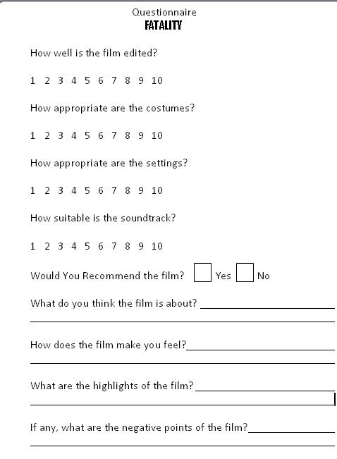
By looking at the results of the questionnaires it seems as though every member of the audience would recommend our film and everyone understood that the theme of our film was fate and how it is unavoidable. People had varying views on the highlights of the film. Some people said that the scene of the mugging was very good, some said the editing of the clown and the lead male where he appears to be hallucinating was “great”. We also received positive feedback about the soundtrack, props and the actors we used. The audience also had different views on the negative points of the film. Some people mentioned that they felt there was nothing negative about the film saying “there are no negative points! It was excellent!”, however a couple of people mentioned that they had trouble reading the fortunes when they came out of the machine.
 Everyone agreed towards the end of the film they felt scared and anxious. We also asked about the use of soundtrack, settings and costume as well as the editing and we received an average of 9/10 on all of these areas. We are happy that we arranged this screen and have taken all of t he feedback on board. We are also very pleased with the positive comments we had and feel that our film would be received very well by a wider audience. Although we understand that this response is not 100% reliable and people may feel they can not give an honest response or feel pressured to over exaggerate the positive points, and the environment the film was show in may not have given the appropriate effect that we wanted the film to have on the audience, the comments have given us all a greater confidence in our film.
The concept of “New media” has influenced our project in many different ways. Where “old media” such as books and celluloid film follow a linear form, new media is becoming increasingly more interactive. New media tends to be digital with unlimited possibilities. As its form is flexible and changeable the limit as to when a product is finished is down to personal choice and opinion. New media has influenced our project through such mediums as the website www.youtube.com which we used for research, and the blogs. Both of these media allow public opinion to be easily expressed and reach a diverse audience. New media has also created what is known as a media democracy. This is the right and the ability to produce media texts of a substantial quality due to digital technological advancements. As this democracy grows, the gap between professional and amateur production is closing and with so many texts being produced and distributed the ones that don’t fit in with someone’s personal taste are deemed as “noise” and become obsolete.
There are key relationships between our main task of producing a film and the ancillary tasks of the poster and review. The purpose of the film poster is to promote the film in question and is the first thing the audience sees regarding a new film and they are generally made to anchor the audience’s first impressions of the film. Where the poster is supposed to attract the audience towards the film, a film review can have the opposite effect. Positive reviews can be useful; however a negative review can have a greater impact. Viral reviews can be particularly effective as they can reach a broader audience than reviews in newspapers. It can also be said that some reviews are biased. In the case of Rupert Murdoch, who owns many media companies such as “20th Century Fox” and newspapers like “The Sun”, he can chose what the review says, so he is unlikely to print a bad review of a film that was made by his company. This means that some reviews are not 100% reliable or independent.
Media technology has influenced our project in many different ways. In the stages of research, construction, planning and even the evaluation, media technology played a huge part. Throughout the research we used websites such as www.youtube.com to study other short films. We also used cameras to take pictures of suitable costumes and locations, and our mobile phones to keep in touch throughout the planning and filming stages. When filming we used a video camera and during the editing we used a computer with the software Edit Pro 11. Our blogs are also a key piece of media technology in regards to our project. In every aspect of our film, from start to finish, we have used numerous different types of technology. It would have been impossible to complete our film without all of these.


